Logo & Packaging Design for Petit Papillon
Role: Art Direction / Design
The Client
Petit Papillon is a boutique brand specializing in various jams, offering high-quality, organic, and sustainably crafted goods. The brand aims to blend elegance with a touch of whimsy, appealing to gourmet consumers who appreciate artisanal flavors and high-quality, sustainable ingredients.
The Scope
The objective was to create a refined logo and packaging design that would capture the essence of Petit Papillon’s commitment to quality and sophistication. The design needed to evoke feelings of warmth, trust, and premium craftsmanship while incorporating the island’s butterfly-like shape into the logo, reinforcing the brand’s name and regional identity.
Brand Strategy & Design Approach
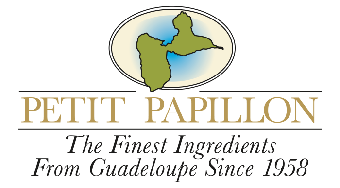
Logo Design
We developed a delicate and timeless logo featuring a stylized butterfly, symbolizing growth, transformation, and gentleness. The typography balances sophistication and playfulness, ensuring broad appeal.
Color Palette & Typography
A soft, muted color palette was chosen to reflect the brand’s organic ethos, with pastel tones evoking a sense of calm and purity. Elegant serif and script fonts were selected to enhance the brand’s boutique feel.
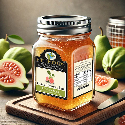
Packaging Design
The packaging was designed with sustainability in mind, incorporating high-quality materials and a clean, elegant design. Each product features delicate fruit photography and subtle branding elements that reinforce Petit Papillon’s artisanal craftsmanship.
Execution & Outcome
The final branding and packaging successfully positioned Petit Papillon as a premium yet approachable brand in the baby products market. The cohesive visual identity enhanced brand recognition, creating a strong emotional connection with its target audience. The use of sustainable packaging further reinforced the brand’s commitment to eco-conscious consumers.
Conclusion
Through thoughtful design, we crafted a distinctive and elegant identity for Petit Papillon that embodies its values of quality, charm, and sustainability. The logo and packaging design not only elevated the brand’s aesthetic appeal but also reinforced its market positioning as a trusted name in artisanal baby products.